Watson Ansley
Watson Ansley
This past March 2021, we moved into our new home. It was new construction, but we weren’t able to pick any finishes or designs out due to the timing of purchase. So, we decided we would come in and change some features on our own to make it more our style!
You may have seen some of the progress I’ve shared on Instagram over the last few months, but in case you missed it or want a recap, I decided to do a fun little before and after blog post here! It’s so fun seeing the progress and transformation.
(note: some of these pictures were taken a few months ago, so we have since added a few things like the TV, etc)
If you’re in a similar situation in life or maybe you’re just wanting to redo or update some features in your home, I’ve shared everything below.
Each of the “After” pictures include clickable links to shop.

(our exact living room chandeliers are out of stock, so I’ve linked these similar ones)
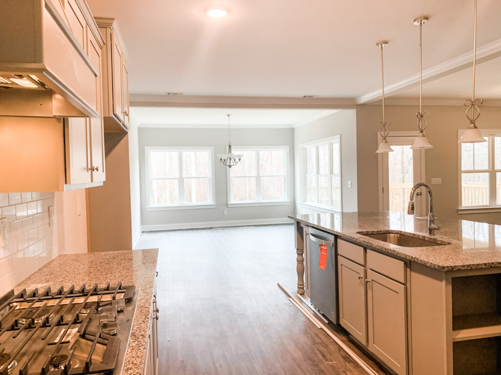
One of the big changes we made in our kitchen was changing out our countertops. When we moved in it was a dark granite. We knew we absolutely loved our white quartz in the last house, so we decided to do something similar in our new house. It made such a difference and really helped lighten up the space. We used someone local, but they did a great job!
In addition, we changed out all the hardware and light fixtures. I was a little unsure at first which color and finish I wanted but at the end of the day, we said “let’s take a little bit of a risk”. We went with gold and could not be happier with how everything turned out!
I’ve linked everything above if you’re interested!

Look at this transformation!! It’s amazing how a few small changes can transform an entire room! We immediately knew we wanted to get rid of those island pendants, but we weren’t quite sure what to put there at first. We ordered 2 other options before finally landing on these!
We ordered black shades, which ended up being too big and probably would have been too dark for the space, then we ordered a smaller white shade, but it had a roping cord which we didn’t love, plus, I thought it may be too much white with the counters. So, we thought it may be best to do a glass that would open up the space more and would make it easy to look straight into the living room.
We found these in a few different sizes and loved the gold accents. Although, it wasn’t the exact same shade of gold, it ended up tying the whole space together! We also decided to add dimmers in the outlets, so the lights weren’t blinding in the mornings or late at night. We love how these turned out!
Click above to shop any of these items.,


This kitchen dining space needed a pop, and we knew immediately we wanted to swap out that light fixture as well. This was one of the first lights Austin switched out, and it definitely adds such a glamorous touch to this space! I love how it ties in all the gold and black together throughout the whole kitchen and living room!
The kitchen table and chairs are actually older, but I’ve linked a similar chair option above.
Just click above to shop!

Now for the “Office”. This was a bit of a debate in our house, because I really wanted to make this space a formal dining room as it’s the first room off the front door entrance. However, Austin really wanted to make it an office (at least for now until our basement is finished), since we already have a table in the kitchen.
Our house didn’t have a designated “office”, so we figured we could make this an office if it’s kept tidy and looks presentable enough for people to see as they walk in our front door.
First thing we did was change out the light fixture again. We went kinda wild in this room;). Totally fun and different! We also added a dimmer to this light as well, which is so nice to have now and will be great if we do make this a formal dining room down the road.
We finally ordered a desk after looking for a long time. We wanted something that had plenty of drawer space but also wasn’t super bulky, since we have windows and doors surrounding.
Austin found this one on Wayfair with a matching file cabinet drawer (that is totally disguised- see below). We love how it turned out in this space. It’s the perfect size, has plenty of drawer space and was a great price!
The leaning black shelves behind the desk are from our last house, so we placed them here for now, and I actually think we may keep them here:). They screw into the wall if needed, but these are such gorgeous shelves for books or decor. They are also offered in a smaller version and in white!
I’ve linked everything above.


This is the “disguised” file cabinet drawer I mentioned above. You would never know it holds files by looking at it, which I love!
Austin missed our big industrial bourbon shelf from the last house, so he decided to add a mini bourbon shelf here in this little corner of the office. I love how it looks tucked away slightly tucked away.
Everything is linked above (except the lamp which was a hand me down).

Boob light gotta go! Haha!
I didn’t have a better foyer picture of this light before it was finished, but you can get an idea here of how it looked before.
We wanted something that was a statement but wasn’t hanging too low or too big, since our ceilings aren’t super high by the front door.
This semi flush mount light turned out great for this space. It’s the perfect mixture of a subtle statement! The black ties in well with the other fixtures on this floor as well! Plus, it was super affordable.
I’ve linked it above for you to shop!


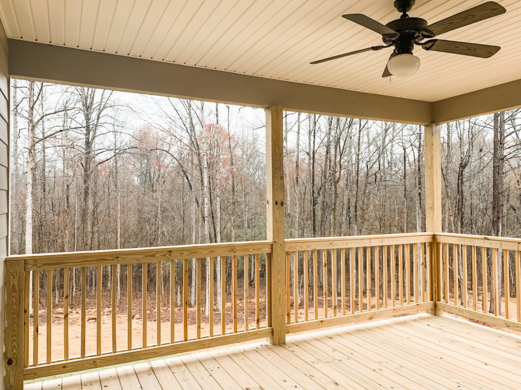
Right off our kitchen and living room, we have a porch. We wanted to be able to enjoy nights outside with wine, dinner, and music especially while the weather was nice in the Spring.
We were actually walking through Home Depot and saw this patio table and chairs. We weren’t even necessarily looking for it, but it was absolutely perfect for our space! It came with the cushions too, plus you can even add an umbrella in the center if you wish!
The price was too good to pass up, so we ordered it and the delivery was super fast as well! Wins all around!
I wanted to add a rug to pull the whole space together and found this really pretty outdoor rug. I love how the darker color and pattern goes well with the patio set and also hides and dirt, pollen or food droppings;).
Lastly, Austin snagged this grill for quick and easy meals. We actually have a Traeger as well, but he found himself not using that one as much, since it was more of a smoker and took longer. This grill is only $179, and we absolutely love it!
Everything is linked above for you to shop!
This house reno has been so much fun, and we have loved seeing all of the transformations so far. I hope you have also enjoyed following along throughout the process and have found some inspiration if you are also hoping to make some changes to your home!
Stay tuned for a powder bathroom blog post soon where I will be sharing all the updates we made as well as the wallpaper process;).
Until next time…